

Summer has always been the peak consumption season for the beer industry, but 2026 is showing a clear shift: packaging is no longer just a supporting sales element—it has become the center of brand positioning strategy. In a market where consumers make decisions within seconds, where visuals spread faster than content, and where personal experience matters more than familiarity, beer packaging design has become both the “first touchpoint” and the “decisive touchpoint.”
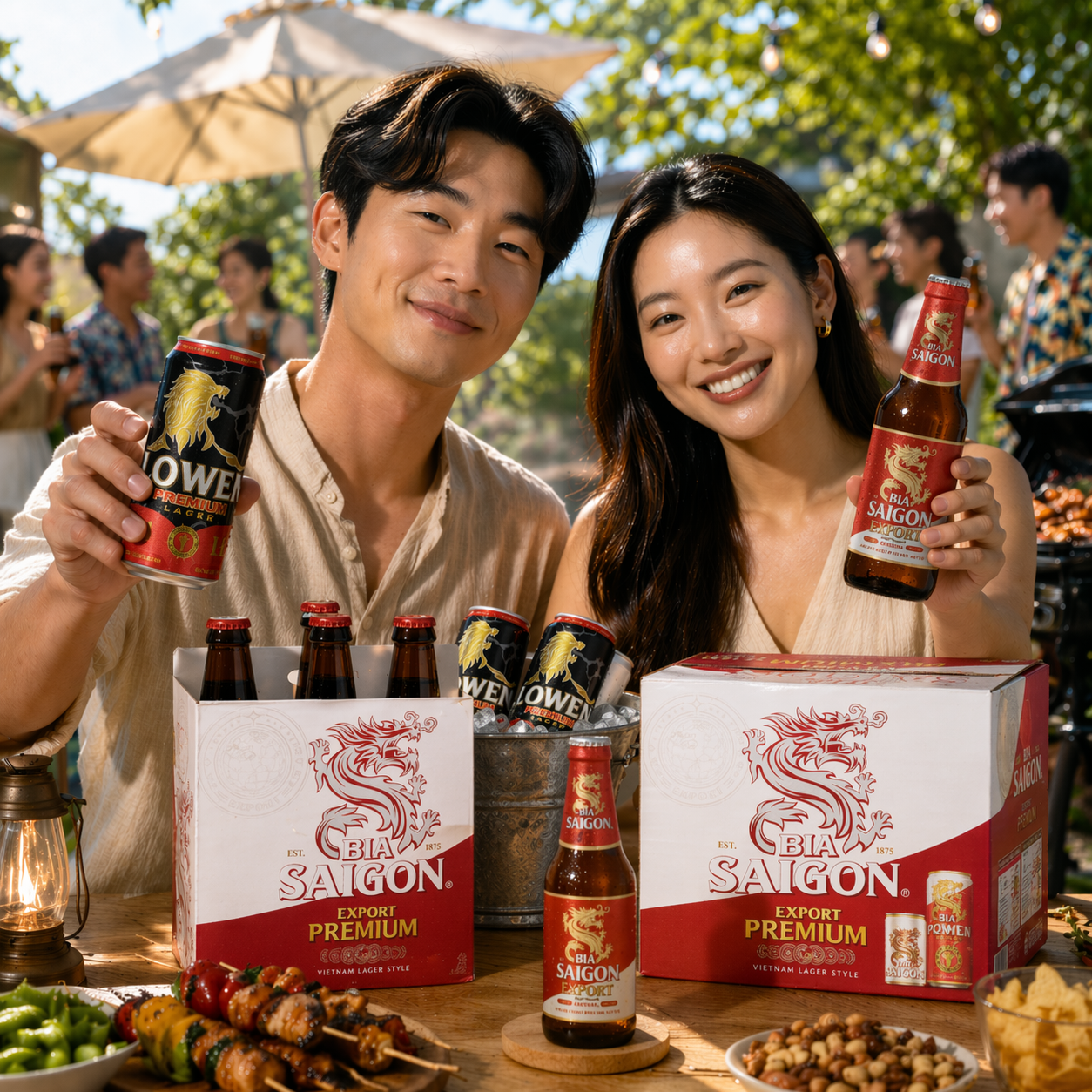
If we look deeper into the trends of 2026, it becomes clear that beer packaging is shifting from “product decoration” to “intentional visual experience creation.”
Minimalism is no longer just a style—it has become the language of premium positioning
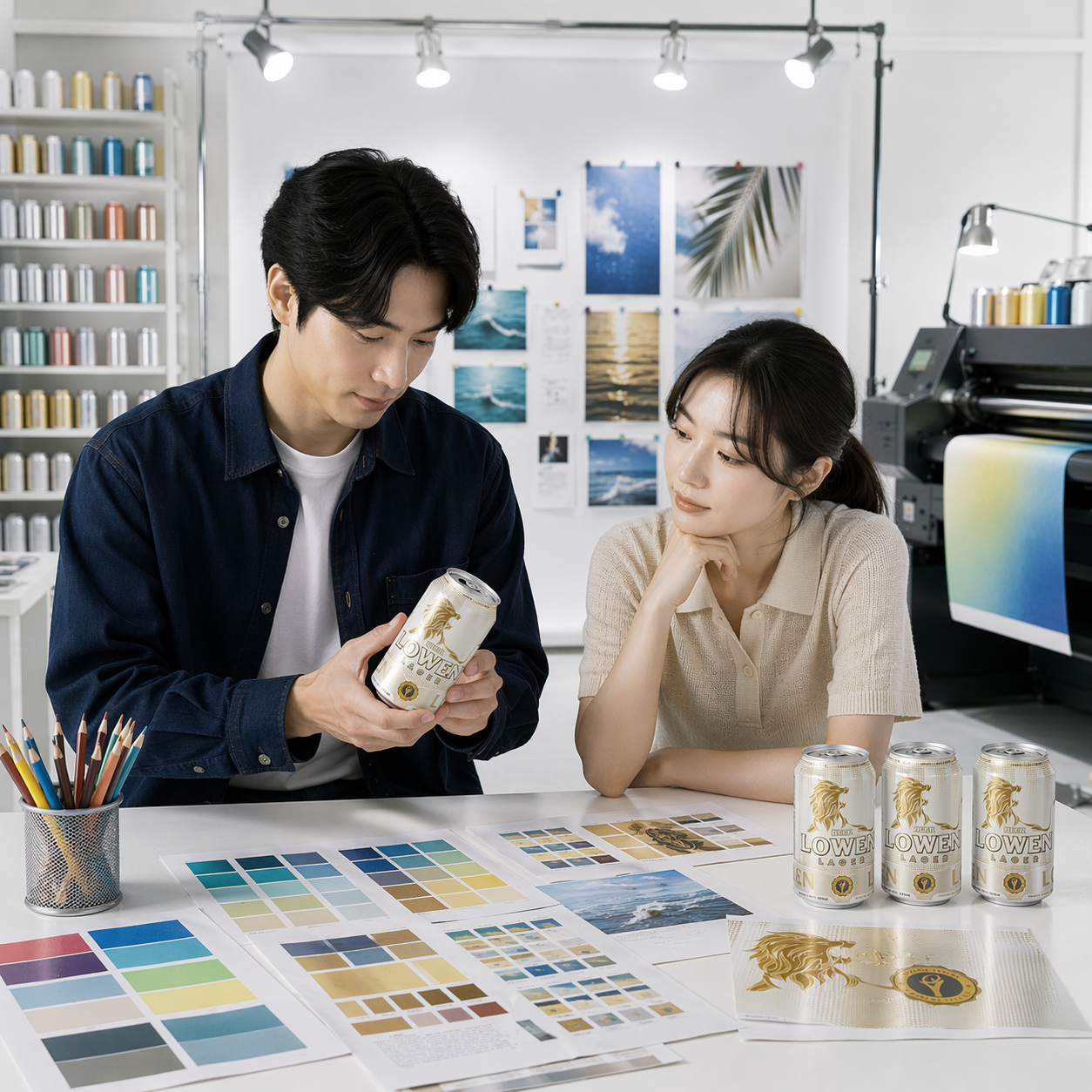
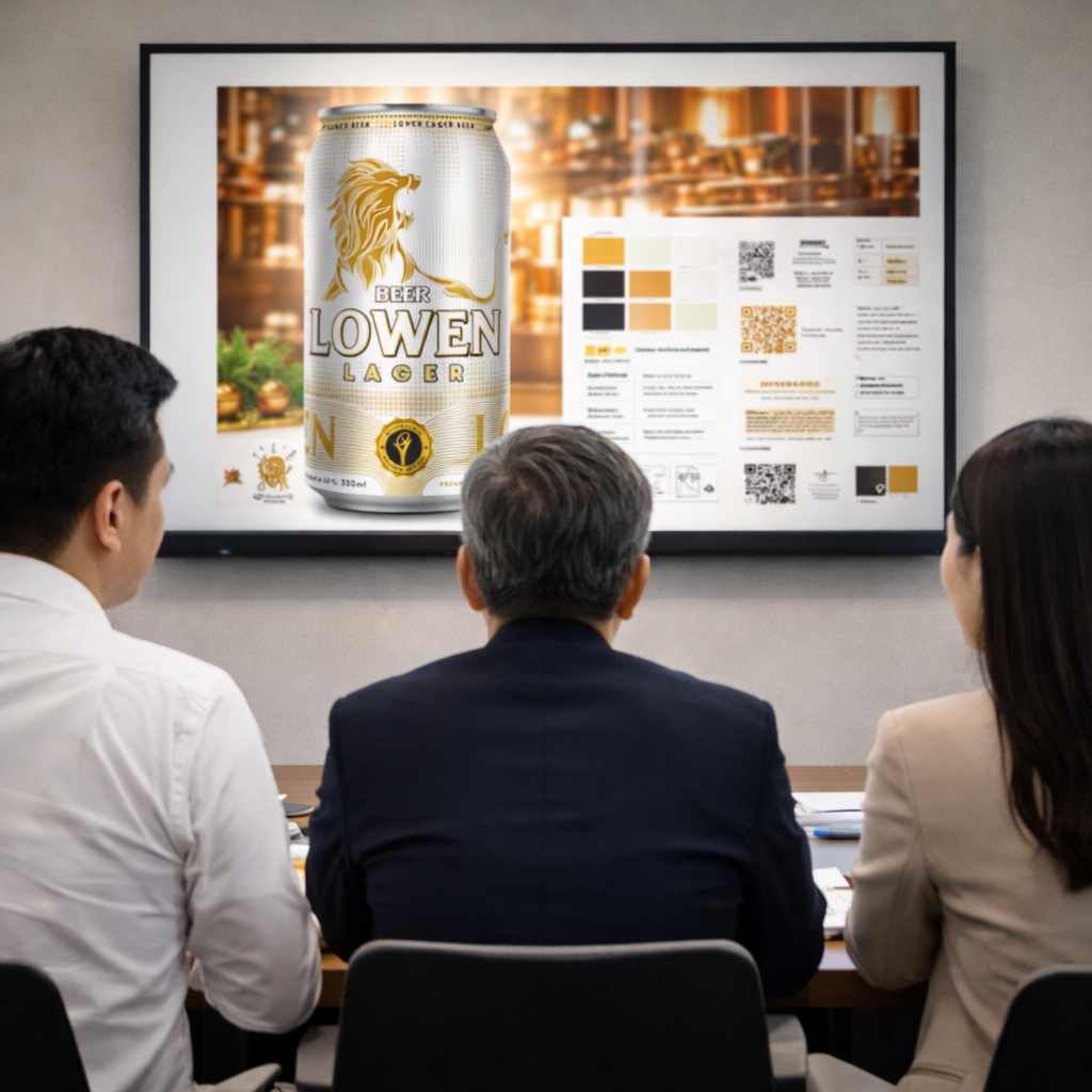
One of the most noticeable changes is the rise of minimalist design, but not the kind of minimalism that simply “removes elements to look clean.” Instead, it is strategic minimalism. Summer 2026 packaging no longer tries to tell too many stories; it focuses on a single message, expressed clearly, decisively, and instantly recognizable.
This perfectly reflects modern consumer behavior. Buyers no longer read packaging—they “scan” it. Within those few brief seconds, the design must communicate the positioning: premium or mass-market, youthful or refined, easy-drinking or bold. Brands that understand this have shifted toward using negative space, clear typography, and controlled color palettes to create a sense of “premium value” at first glance.
As a result, minimalism does not reduce perceived value. On the contrary, it increases brand credibility and professionalism.
Packaging must not only look good—it must evoke emotion and feel human
Alongside the minimalist movement, another strong trend is emerging: emotionally driven design with a “human touch.” In a world where more and more visuals are generated by technology, consumers are increasingly drawn to imperfection—hand-drawn lines, raw textures, and details that feel handcrafted.
As a result, summer 2026 beer packaging is no longer focused solely on aesthetics, but on creating authenticity. Designs inspired by illustration, local culture, or retro materials are being used to create familiarity and differentiation.
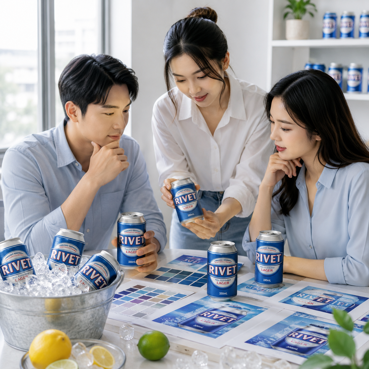
Especially during summer, emotional elements become even more important. Colors are no longer just colors—they represent temperature, sunlight, and the feeling of vacation. Successful packaging is packaging that makes consumers “feel the summer” before they even open the beer can.
The Sleek can is no longer a trend—it has become a lifestyle symbol
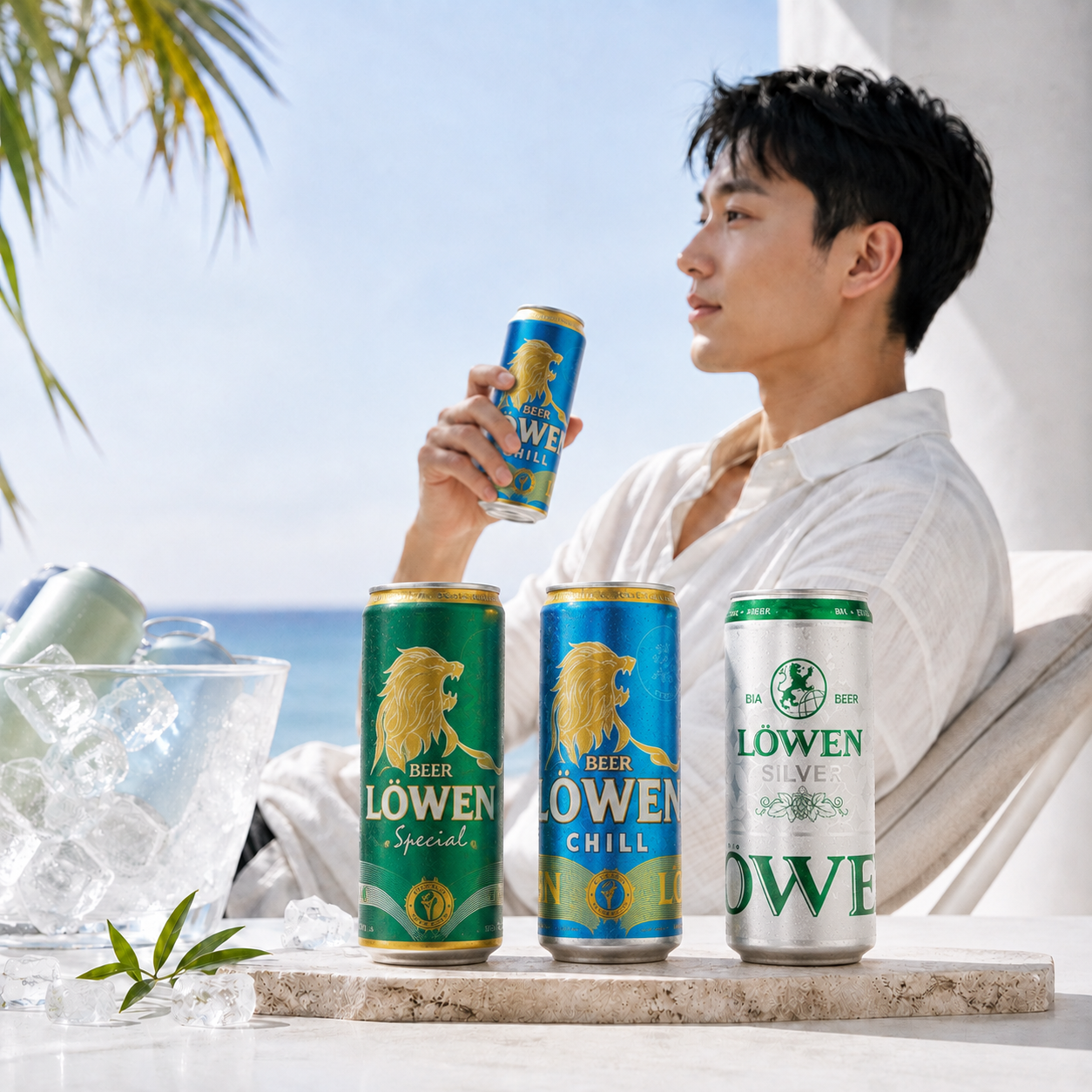
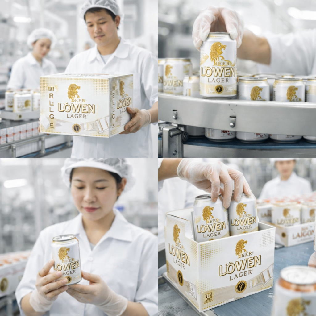
If there is one image that represents beer packaging in 2026, it would be the Sleek can. However, what matters is not only its shape, but the meaning it conveys.
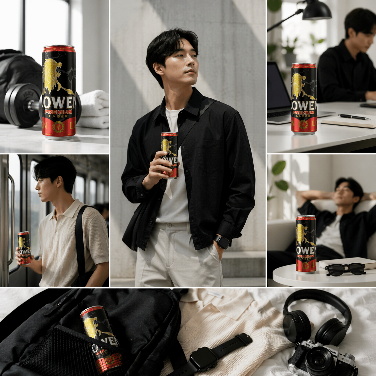
The Sleek can has evolved beyond its role as packaging to become a lifestyle symbol. When held by consumers, it no longer represents just the product—it represents a way of life: modern, clean, dynamic, and highly shareable. In the social media environment, where every photo becomes a personal statement, the Sleek can has become the “perfect prop.”
For this reason, brands are no longer choosing the Sleek can solely for convenience or logistics, but because it helps position the brand in the minds of younger consumers. A well-executed design on a Sleek can can create stronger viral impact than many advertising campaigns.
Packaging becomes a cost-optimization tool, not just a cost
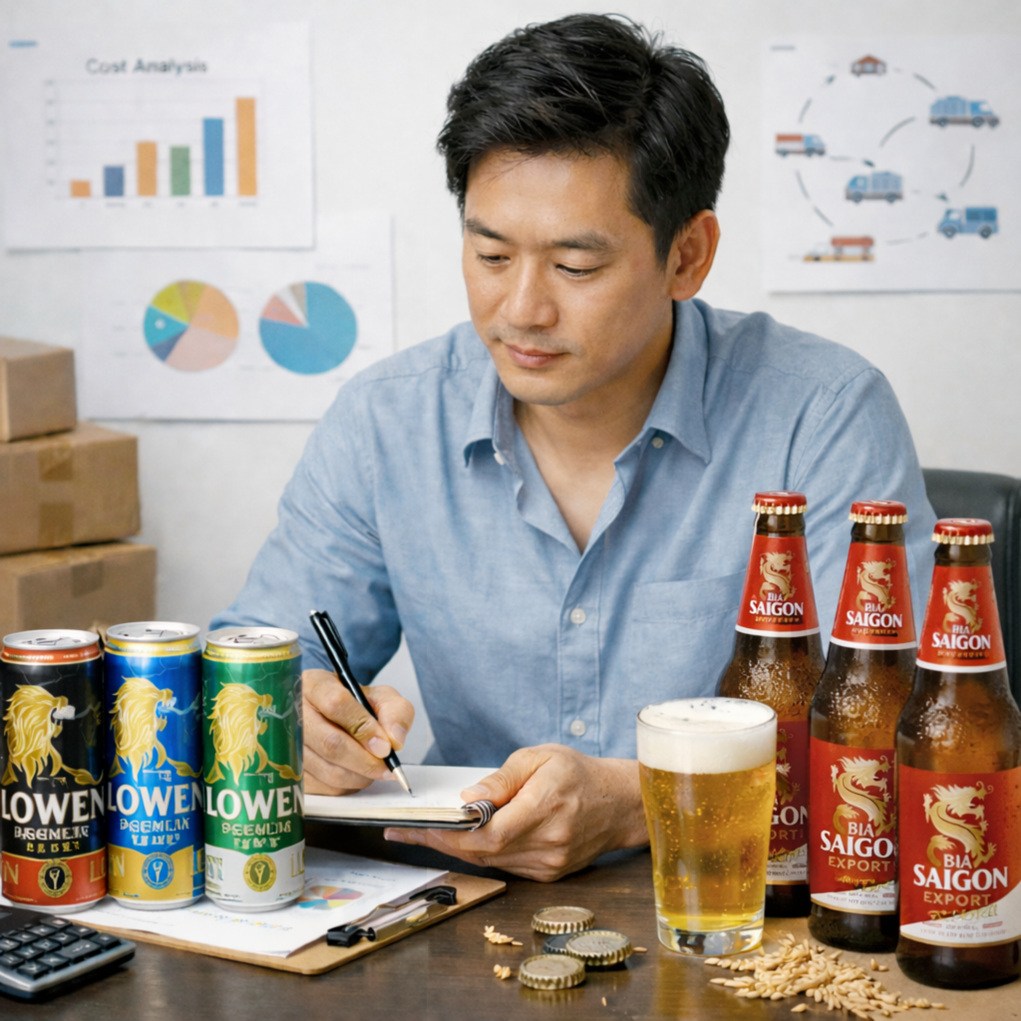
One strategic but less visible shift is the role of packaging in cost structure. As competition becomes increasingly intense, businesses can no longer view packaging merely as an expense to “make the product look good.” Packaging has become a financial variable.
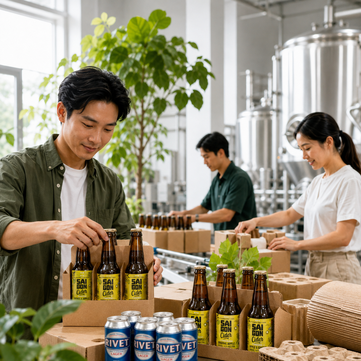
Aluminum cans are lighter, easier to stack, and less risky during transportation. This not only reduces logistics costs, but also optimizes warehouse space and minimizes product loss. In contrast, while glass bottles may create a more premium perception, they also lead to higher operating costs and greater breakage risk.
As a result, every packaging decision in 2026 comes with a strategic question:
Does this design help the business generate profit more efficiently?
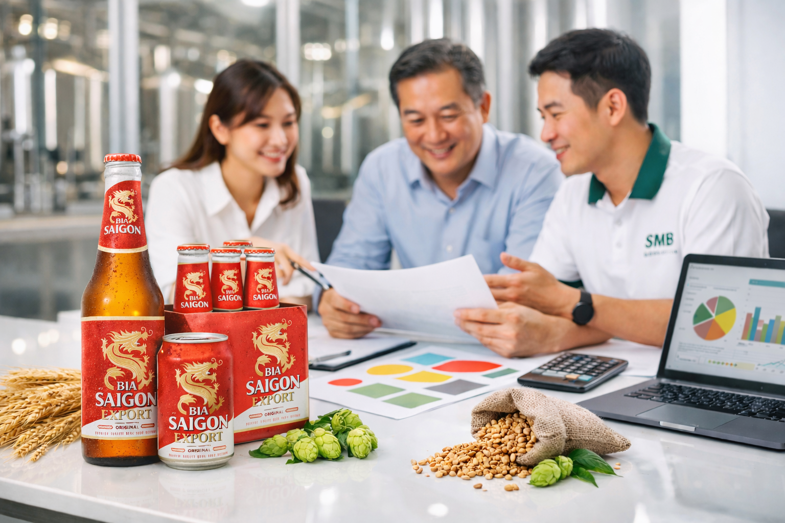
At OEM beer systems such as Bia Sài Gòn Miền Trung (SMB), packaging decisions are not made emotionally. Instead, they are advised based on both brand positioning and cost structure. This helps businesses avoid a common mistake: creating a beautiful product that cannot scale effectively.
Transparency and the “healthy feeling” are beginning to shape design
A new trend that is accelerating rapidly is the shift in health awareness. Consumers no longer view beer purely as an entertainment beverage—they are increasingly paying attention to ingredients, alcohol content, and the “lighter feeling” associated with consumption.
This shift is directly reflected in packaging. Designs are becoming cleaner, brighter, and easier to understand. Instead of trying to impress through excessive detail, packaging is moving toward creating a sense of trust, simplicity, and transparency.